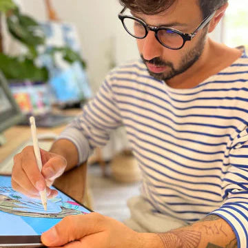
Article: In the studio: Alberto Casagrande on Milano21 and Italian Futurism
In the studio: Alberto Casagrande on Milano21 and Italian Futurism
Milan is a city built on movement — trams gliding past stone façades, traffic humming beneath neon signs, people flowing between fashion districts, studios, and stadiums. Here, history sits next to glass and steel, and the skyline feels less like something fixed and more like something in constant rehearsal. It’s a city of design, noise, rhythm and light — just like the feeling of charging down the final stretch at Milano21.
For this year’s official Finisher Artwork, 'Biscione Milanese', we teamed up with Milan-based illustrator Alberto Casagrande to translate that energy into art. We sat down with Alberto to dive into how he reimagined the city through its iconic Biscione, why Futurism and “rocking” visuals found their way into the piece, and how Milan’s streets, landmarks and runners all became part of the same living symbol.

Q: What was the first spark or idea that led you to shape Milano21’s artwork around the Biscione?
Alberto: The Biscione felt like the most natural starting point. It’s one of Milan’s oldest and most recognizable symbols, but it also carries a sense of motion, mythology, and identity. When I thought about the energy of a race weaving through the city, the serpent immediately became a metaphor for flow: something ancient, dynamic, and unmistakably Milanese. That was the spark: taking a historic emblem and letting it become the heartbeat of a contemporary event.
Q: Milano21 has a strong “rocking” identity this year — how did that influence your artistic approach?
Alberto: It came naturally from the way I draw: bold contrasts, sharper rhythms, and a visual language that doesn’t sit still. I always create artworks that feel loud, that explode in the page and rely in asimmetrica balance to create movement and energy. Of course I had to blend it with Milan’s elegance, so I paired the vintage, art deco vibe of the city with some graphic, and typographic, grit.
Q: Your composition blends architecture, symbolism, motion, and typography. How did you decide which elements of Milan to highlight?
Alberto: I chose elements that speak to both the everyday and the iconic. Milan has landmarks everyone recognizes, but it also has elements that escapes the fashionable side of the city. I wanted a balance: the symbolic power of places like the Duomo, the skyscrapers and the iconic Navigli, but also a strong tribute to the suburbs, the old working class buldings, the facades covered with tags and graffiti.
Q: The artwork has a dynamic line and rhythm running through it — almost like a visual soundwave. Was this intentional?
Alberto: Absolutely. I wanted the entire piece to feel like it moves, like you could almost hear it. The line acts as both a pulse and a pathway. It echoes the cadence of running, the vibration of a city that never stops evolving.
Q: The Biscione also acts as the race route in your concept. How did you approach weaving storytelling into the illustration?
Alberto: By letting the Biscione become a narrative thread. It guides the eye through the city the same way the race guides runners through Milan. Every twist of the serpent leads to an architectural or symbolic moment. So rather than arranging elements randomly, the composition follows the idea of moving through Milan at human scale, discovering its layers with every kilometer.
Q: Futurism and 20th-century Italian design seem present in your lettering and structure. How do these influences show up in your work?
Alberto: Italian Futurism has always fascinated me. Its obsession with speed, dynamism, and modernity aligns perfectly with my attitude: I’m a frantic, volcanic person who rarely stands still and is always eager to create. And I think this approach fits beautifully with the concept of a race!
Also, with a background rooted in graphic design, I can’t help but love Futurism’s visual approach — its limited palettes, its mechanical reinterpretation of natural forms, its bold and experimental lettering.
I try to incorporate these ideas into my own visual language, hybridizing them to make them feel fresh and contemporary, adjusting the “vintage knob” depending on the needs of each project.
Q: How important is it for you that an artwork connected to a race also reflects the cultural identity of the city?
Alberto: For me it’s essential. A race is not just a sporting event; it’s a collective experience that happens in a very specific cultural landscape. When athletes travel to Milan, they don’t come just for kilometers: they come for atmosphere, history, beauty, and a sense of place. The artwork should honor that. It should feel like Milan even before you read the name.
Q: When runners look at their personalized piece after the race, what do you hope they feel or notice first?
Alberto: I hope they feel a sense of accomplishment intertwined with belonging. I want them to recognize elements of the city they ran through: moments they may have passed in a blur but can now revisit visually. Ideally, the first thing they notice is the movement: the way the lines, shapes, and colors echo the physical experience of running through Milan.
Q: You work across illustration, visual design, and Milanese cultural expression. What does creating the official Milano21 artwork mean to you personally?

